Friday, December 5, 2014

Colour Pop : Review & Swatches


So, have you guys heard of Colour Pop? If you follow any beauty folks on Instagram/are active on Reddit, I feel like you probably have. They seem to be taking over the world of social media and with good reason; they're an LA based company offering lipsticks, lip pencils, and eye shadows for a whopping price of $5/each. They also offer free shipping on orders over $30, which is pretty easy to hit, so they've got that going for them, too. I can't remember where I first found out about Colour Pop, but I think it was on Reddit and the first colour (haha, get it?) I saw was the shade "Creature". It was this glorious dark burgundy shade and after that, I knew I had to order some things.


The Colour Pop website is incredibly easy to navigate and really well built which is awesome considering how new they are. You can search, there are categories, and the photos are great... which I'm usually highly critical of since I'm a product photographer. They also swatch their lip colors on light, medium, and dark skin tones. Now, they don't swatch each shade on all three, but it looks like they're working on that. I placed an order on November 14th, it shipped November 19th (two weekend days in there), and it arrived on November 22nd. Not bad for a company that is still fairly small (I assume).

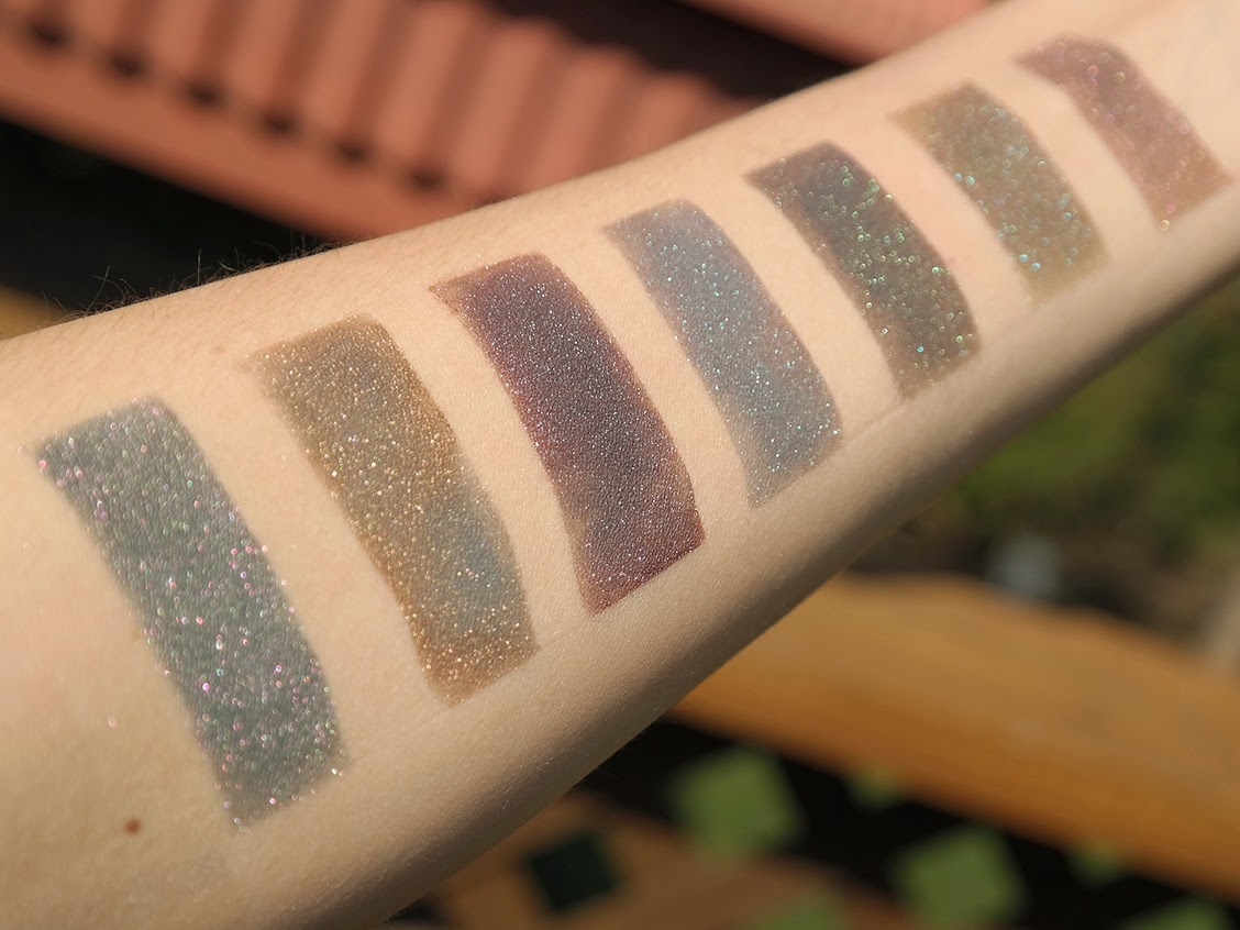
I don't have a picture of it, because I forgot, but I did receive a little personalized note from them that said "Hi Allison, We're going to call you dandelion. Love, Colour Pop" The order was packed well in an interior box, stuffed with paper (thank god, I can recycle this!), and then in a larger box. Each lipstick, lip pencil, and eye shadow comes in its own little box. I am not going to talk about the eye shadows in this post, I'm going to do a separate post for those, so today will be all about the Lippie Stix and Lip Pencils.


a little dirty... it's been used.


I got the following lip items:


  • Creature Lippie Stix
  • Creature Lip Pencil
  • Brink Lippie Stix
  • Brink Lip Pencil
  • Fetch Lippie Stix


Creature is "A deepened blackened burgundy red in a matte finish aka 'a sultry, fierce red for the world dominator' ". For these swatches, I used the lip pencil and the lippie stix together. I need to sharpen the lip pencil... which is why it looks a bit soft on the outlining. Whoops.

The pencil and the lippie stix in Creature apply amazingly and are opaque immediately. I am love with this color and this texture. My lips were slightly chapped when I applied this product for the photo, but you can barely see it! It doesn't cling to the dry patches badly, at all, and it looks lovely on the lips. 

A+


Brink is "a warm dusty taupe in a matte finish. Curated by @brittanysuleiman. Inspired by the insta-famous Kylie lip". I won't lie, I bought this specifically for that last line "Kylie lip". I cannot stand the Kardashian clan, but fuck, does Kylie Jenner has great lip colors! This shade turns a little too warm on me to make it a true dusty taupe, but it's still a fantastic color. This was obviously swatched the same day as Creature (all of these swatches were done the same day), so my lips were still slightly chapped when taking these photos. Can you see any flaky skin in these photos? I can't. Amazing. Brink is creamier to apply than Creature, but dries down to a true matte. This shade is also completely opaque upon first swipe, which is fantastic. The only thing that I noticed that miiiight annoy some people is that the lip pencil is slightly darker than the lippie stix; to me this is no big deal for a nude shade and is actually what I prefer, but I realize that some people might not be into that.

A+


Fetch is a "perfect mid- tone warm true pink in a satin finish. Cuz this shade is like so like o.m.g, totally fetch". Ok, I'm going to be completely honest and say that I bought this is because it is called Fetch and I am a HUGE Mean Girls fan. Case in point:

yeah... this happened

I don't own a lot of true pink lipsticks because I don't feel like they look amazing on me. I bought this mostly because of the name, but also because it was a $5 investment into something that I wasn't sure about. This is a satin shade, which is different than Brink and Creature, which are both mattes. This color definitely has a slip to it when applying and it isn't nearly as opaque as the other two. It can easily be built to be opaque, but it takes a bit more effort. This shade, which is a tiny bit milky (meaning that the base is somewhat white), can be a bit patchy. Rubbing your lips together takes care of this issue, but it can still be a pain. I actually do like the color quite a bit, so yay! However... this shade broke when I opened it. Not in a major way, the tip of the stick broke off and not wanting to have to return it and replace it, I just picked it up off the counter and stuck it back on. 

B+

So there you go! If I'm being 100% honest with you, I not only will be ordering from Colour Pop again, I already have. I placed another order this morning and got Lumière, their newest shade, along with a few gifts. If you guys are interested, check out their website and scroll around, see if you find anything you like.

Questions, comments? Let me know down below!

Thursday, December 4, 2014

Limnit Lipstick : Swatches


Another day, another indie to tell you guys about... or more accurately, remind you about. A few months back, I posted a review and some lip swatches from Limnit and I finally got around to ordering a few other colors that I had wanted to get my hands on. Trina had closed for a bit in the early fall but when she reopened, I jumped on the opportunity to get these shades. I only ordered Bewitching Hour and Ms. President, but she threw in Deepest Taupes and Dreams to thank me for my previous review! How sweet? Seriously, this is why I love the indie scene.

Onto reviews and swatches!


Ms. President is, as Limnit describes it, a "bold, semi-matte, opaque, vegan, brick orange-red" shade. It is definitely the most opaque out of the three that I got in the sense that it is just completely opaque in one swipe of the lip brush. This shade was soft and applied super easily and left behind very little, if any stain on the lips.


Bewitching Hour is a "bold, semi-matte, opaque, vegan, dark midnight blue" shade. This was actually the third shade that I applied, which is why my line work is a little shoddy on this... I found this to be fairly opaque on the first swipe, but it did take the tiniest amount of work to get even all over the lips. I actually bought this shade so that I can mix it with Goodness Graycious and make all types of fun colors, but I think I'll probably be busting it out on its own as well. Word to the wise, this shade will stain your lips, so don't think that you can just casually wear it and then wipe it off half way through the day.


Deepest Taupes and Dreams is a "bold, semi-matte, opaque, vegan, dark brown" shade. This was my free shade and it isn't something that I would have picked up on my own. In real life, the shade is definitely more grey, but the lighting here is making the shade look much warmer. This is also extremely dark brown and if you aren't looking closely, can really look black from a distance. I had the most trouble with patchiness with DTAD, but simply blotting and going over the shade takes care of the issue. I'm not sure if I'll be wearing this one as often (OH MY GOD, A COLOR THAT I'M NOT COMPLETELY CONFIDENT IN????), but I might try to keep pushing myself to wear it. 

And there you have it! If you have any questions or comments, please feel free to ask!

Tuesday, November 25, 2014

Aromaleigh Sol Invictus Swatches : Part 2

I really should never say "I'll have the rest of this up tomorrow" when I don't have the follow up post completely done. However, after a few more days, here is part 2 of the Aromaleigh Sol Invictus swatches!

My opinions on these six shadows are pretty much the same as the first six that I posted with one exception. The shade Opalia was a bit funky for me and after searching on Google, it looks like it was an issue for other people as well. I'll talk about it more below, so keep scrolling to see the swatches!

All swatches done over Fyrinnae Pixie Epoxy and shot with daylight bulbs


Aureum: "A richly shimmering soft warm gold with color traveling sparkles of gold/green and red/violet."


Luxuriae Maniae: "An imperial purplish mauve with chestnut tones and a strong and sparkling color traveling duochrome effect that ranges from gold, bronze and copper." 

I do have to say that I wore this to Ulta the other day and the cashier asked me all about it because she thought that the shadow was so amazing...


Munera: "A rich taupe-y shade with brilliant aqua/gold/copper sparkles. If you foil this color, or rub it in to your lips or cheeks, it also leans to the rosy side!"


Opalia: "A delicate opalescent pink with bountiful pink to blue color shift. This color would be a perfect shade for highlighting the brow, or even on the cheeks or to add shimmer to the lips!"

Ok, now for more info on this shade. I've read other's opinions on this shade as well and it seems like we all feel the same way about it. This shade is mostly glitter and not a lot of base, so it applies a bit patchy on its own. If it were layered over something, it would look much, much better.


Unchained Revelry: "A gorgeous berry shade that shifts to a softly metallic copper, with brilliant iridescent fuchsia and blue sparkles and copper iridescence."

Um. Hai. Gorgeous.


Sigillaria: "A gorgeously rich amber which is slightly metallic and having a spectacular amount of strong aqua and fuchsia sparklies."


My overall opinion on the collection is wow. If you like metallic and glittery shadows, this collection is definitely something for you to look into. I have a fairly healthy love affair for all things matte, but I also love shadows that catch the eye and are special... which is exactly what these are. The colors are incredibly unique and I think it's safe to say that I don't have anything like these in my collection. Every shade is multifaceted and aside from Opalia, they apply smoothly and opaquely. Definitely a collection to pick up!

Questions? Comments? Let me know down below!

(these samples were provided to me by Aromaleigh, but this fact has, in now way, altered my thoughts. all opinions are my own and no compensation has been provided)

Thursday, November 20, 2014

Aromaleigh Sol Invictus Swatches : Part 1

Hello dear friends! It's been a really long time since I've posted, but it's been the really busy season at work (I'm a product photographer, so we're getting ready for Christmas!) and I'm just exhausted when I get home. However, I need to get this post up since the ladies at Aromaleigh have been so kind as to provide me with samples of their newest collection; Sol Invictus. Rather than provide you with swatches of all twelve shadows at once, I'm going to break this up into two separate posts. Today, you will get 6 sets of swatches and tomorrow, you will get 6 more. Sound good? Fantastic.

If you remember (or if you just scroll back a bit), I also received samples of the Diavoli collection from Aromaleigh, so I have experience with their shadows. Those of you who are familiar with the indie cosmetics scene, I'm sure, have heard of Aromaleigh. Those of you who are not familiar with the indie cosmetics scene, well, for starters you need to jump on in but also, you need some Aromaleigh shadows. The entire indie world is full of amazing colors and textures, but Aromaleigh really does make incredibly unique and amazing shadows. Every time that I play with their shadows, I'm reminded that the products that they create are just out of this world. The funny thing about it though, is that no matter how beautiful the photos are, they are not even a tenth of how beautiful these shadows are in real life.

Just for a quick overview of all of the shadows; I'm blown away, just like I was with the last collection that I received. The shades are all insanely buttery, especially for shadows that are loaded with glitter! They apply like a dream and with a sticky base (this part is essential for all loose shadows, indie or not), they become this otherworldly entity. Pardon my language, but so fucking gorgeous. I thought that I really liked the Diavoli collection, but whatever my feelings were for that, just multiply it by about twenty and that's how I feel about the Sol Invictus collection. It's amazing.

Ok, onto some photos.

Io, Saturnalia! in the bag. LOOK AT IT.

Just a heads up, these swatch files are fairly large because I want you to be able to look at them in all their glory. If they're taking a while to load, just give them a minute... they're kinda huge.

All swatches done over Fryinnae Pixie Epoxy and shot under daylight bulbs.


Io, Saturnalia: "A smooth rich teal blue with prominent gold/copper/red color traveling sparkles. " 


Lord of Misrule: "A gorgeous taupe base with really strong orange-red-violet color traveling iridescence. It’s a neutral with an amazing, shimmery twist!" (I definitely want to get a full size of this. LOOK AT IT)


Lua Saturni: "A heathered deep indigo/violet (will change from more blue to more violet depending on your viewing conditions) with dominant blue to teal sparkles that color shift to fuchsia/red."


Oscilla: "An exquisite shimmering peach with oodles of icy blue, pink, copper and gold color traveling sparkles." (editor's note: UNGHHHHH.)


Sol Invictus: "A beautiful coral/orange shade with a slight golden undertone in certain lighting, bedazzled by color traveling orange-violet-fuchsia shimmer and bright green sparks."


Topsy Turvy: "A gorgeous multi-dimensional festive green with amber metallic lowlights and color-shifting highlight sparkles that keep this color ever-changing."

Quick eye look using Sol Invictus and Oscilla


And that's it for today! Stay tuned tomorrow for the remaining shades.

Questions? Comments? Let me know down below!

(these samples were provided to me by Aromaleigh, but this fact has, in no way, altered my thoughts. all opinions are my own and no compensation has been provided)

Thursday, October 2, 2014

Aromaleigh Diavoli Collection : Swatches

About two weeks ago, I was on reddit and I saw that Carol from Aromaleigh was looking for bloggers to swatch the Diavoli collection that they had recently put out. The reason for this is that the shadows are intense duochromes... which makes them very hard to photograph. I, however, was up for the challenge and I contacted her saying that I was interested! I did receive these samples for free, but that doesn't sway my opinion on them in any way, shape, or means. Whatever I'm writing here is my honest opinion and I'm not being compensated by Aromaleigh for posting this. Now, with that out of the way...


You may be asking yourself, "What the hell does diavoli mean?" and honestly, I didn't know either... I speak French, not Italian. However, upon a quick Wikipedia search, diavoli is the plural of devil! This makes sense because the shadows are named for the Malebranche which are the 13 devilish demons who patrolled the 5th Bolgia in Dante's Inferno. 

I think that I did this in my last swatch/review post, but I'm doing this again because these indie creators make it so simple. All of these shadows applied incredibly easy, went on smoothly, and were opaque in no time. There is only one shade that did swatch incredibly well, but it was user error and not the shadow itself (I know because I've since swatched it and it's fine). Literally, all of these shades are so incredibly beautiful and I feel like every review that I've read on them has said the same thing: photos just cannot capture how pretty these are. Duochrome is hard to photograph in the first place since it's all dependent on lighting, but since these are so intensely duochrome-d, it's even harder. I tried my best though and without further ado; the swatches!

All shadows swatched over Fyrinnae Pixie Epoxy.


This is the swatch that I messed up while I was doing it; I got some pixie epoxy on my finger while I was applying the color and it just create an odd spot. This shade was also the least visibly duochrome like for me. If you have Shenanigans from Fyrinnae, I found these two to be very similar. I love that the base is a bit of a dark gray with the intense coppery/gold on top; it makes for an amazing shadow.


The shadows with the green shifts show the most dramatic effect in regards to the their duochrome. As you can see, this looks like two completely different shadows between the natural lighting and the direct sunlight.


In direct sunlight, Farfarelle and Graffiacane look very similar, but when you can see them in natural lighting as well, you see their difference. Their bases are similar, but what they reflect is not; Farfarelle has far more pinkiness to it, while Graffiacane has a strong green to it.


Libicocco is my absolute favorite shade from this entire line. I want to live in this shade.


Malebranche and Rubicante are two shadows which tend to look very similar even in the packaging; their differences are very subtle. Malebranche is more warm toned all around whereas Rubicante has a warm base with blue overtones.


And to give you a better idea of how these all look next to one another, I present you with some full arm swatches!


From L to R: Alchino, Barbariccia, Cagnazzo, Calcabrina, Ciriatto, Draghinazzo, Farfarelle


From L to R: Alchino, Barbariccia, Cagnazzo, Calcabrina, Ciriatto, Draghinazzo, Farfarelle


From L to R: Alchino, Barbariccia, Cagnazzo, Calcabrina, Ciriatto, Draghinazzo, Farfarelle


From L to R: Alchino, Barbariccia, Cagnazzo, Calcabrina, Ciriatto, Draghinazzo, Farfarelle


From L to R: Graffiacane, Libicocco, Malacoda, Malebranche, Rubicante, Scarmiglione


From L to R: Graffiacane, Libicocco, Malacoda, Malebranche, Rubicante, Scarmiglione


And if you've made it this far, I will reward you with GIFS!!!


Questions? Comments? Let me know down below!