You may be asking yourself, "What the hell does diavoli mean?" and honestly, I didn't know either... I speak French, not Italian. However, upon a quick Wikipedia search, diavoli is the plural of devil! This makes sense because the shadows are named for the Malebranche which are the 13 devilish demons who patrolled the 5th Bolgia in Dante's Inferno.
I think that I did this in my last swatch/review post, but I'm doing this again because these indie creators make it so simple. All of these shadows applied incredibly easy, went on smoothly, and were opaque in no time. There is only one shade that did swatch incredibly well, but it was user error and not the shadow itself (I know because I've since swatched it and it's fine). Literally, all of these shades are so incredibly beautiful and I feel like every review that I've read on them has said the same thing: photos just cannot capture how pretty these are. Duochrome is hard to photograph in the first place since it's all dependent on lighting, but since these are so intensely duochrome-d, it's even harder. I tried my best though and without further ado; the swatches!
All shadows swatched over Fyrinnae Pixie Epoxy.
This is the swatch that I messed up while I was doing it; I got some pixie epoxy on my finger while I was applying the color and it just create an odd spot. This shade was also the least visibly duochrome like for me. If you have Shenanigans from Fyrinnae, I found these two to be very similar. I love that the base is a bit of a dark gray with the intense coppery/gold on top; it makes for an amazing shadow.
The shadows with the green shifts show the most dramatic effect in regards to the their duochrome. As you can see, this looks like two completely different shadows between the natural lighting and the direct sunlight.
In direct sunlight, Farfarelle and Graffiacane look very similar, but when you can see them in natural lighting as well, you see their difference. Their bases are similar, but what they reflect is not; Farfarelle has far more pinkiness to it, while Graffiacane has a strong green to it.
Libicocco is my absolute favorite shade from this entire line. I want to live in this shade.
Malebranche and Rubicante are two shadows which tend to look very similar even in the packaging; their differences are very subtle. Malebranche is more warm toned all around whereas Rubicante has a warm base with blue overtones.
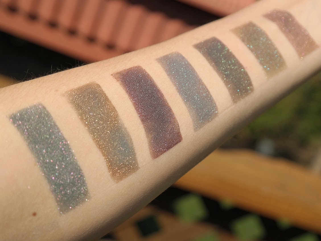
And to give you a better idea of how these all look next to one another, I present you with some full arm swatches!
From L to R: Alchino, Barbariccia, Cagnazzo, Calcabrina, Ciriatto, Draghinazzo, Farfarelle
From L to R: Alchino, Barbariccia, Cagnazzo, Calcabrina, Ciriatto, Draghinazzo, Farfarelle
From L to R: Alchino, Barbariccia, Cagnazzo, Calcabrina, Ciriatto, Draghinazzo, Farfarelle
From L to R: Alchino, Barbariccia, Cagnazzo, Calcabrina, Ciriatto, Draghinazzo, Farfarelle
From L to R: Graffiacane, Libicocco, Malacoda, Malebranche, Rubicante, Scarmiglione
From L to R: Graffiacane, Libicocco, Malacoda, Malebranche, Rubicante, Scarmiglione
And if you've made it this far, I will reward you with GIFS!!!
Questions? Comments? Let me know down below!


